…
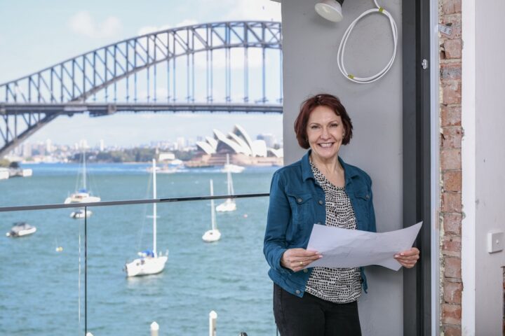
Martina Hayes
Interior Design & Building Design | Sydney
How can we help you?
View Articles

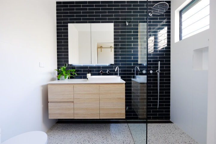
Renovation before-and-after photos
Check out these impressive before-and-after pictures of this Sydney home renovation. The space has been transformed into a bright, modern and practical home.
Renovation Cost Sydney 2024 – What You Need To Know
Is 2024 the year you wish to tackle your home renovation? Before you start, determine how much you need to budget for the complete makeover of your house.
Learn More Renovation Cost Sydney 2024 – What You Need To Know
Add Ensuite To Master Bedroom – Check Out How
You can add an extra bathroom to your home even if you are short on space. Our bathroom experts have created the smallest possible bathroom layout without it feeling tight.

Stay in touch
Leave your email address below to receive occasional tips on interior design and building design delivered straight to your inbox.


